
You designed something you love. The blue glows on your screen. Then the proof shows up and the blue looks like it gave up on life.
Here's the short version, before we get into the why: your monitor and our press are speaking two different languages, and the press doesn't get to make up colors that don't exist on paper. That gap is the whole problem, and it has a fix.
Why doesn't my print match my screen?
Because your screen makes color with light and paper makes color by blocking it.
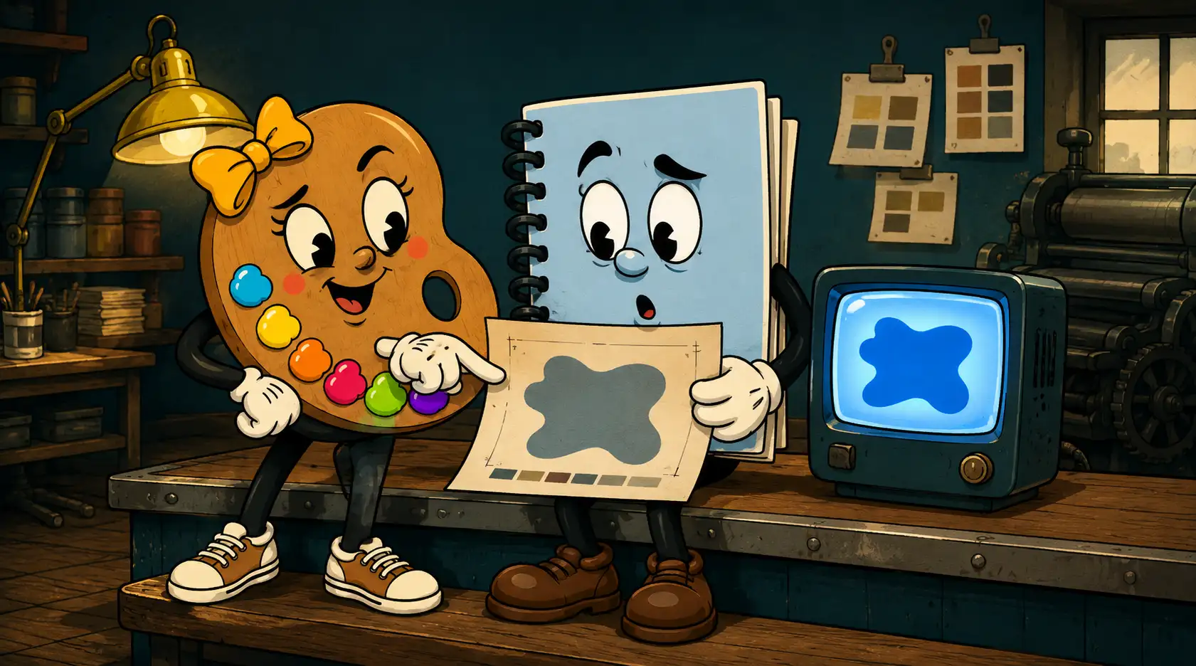
A screen is lit from behind. It builds color by mixing red, green, and blue light, and it can throw an absurd range of bright stuff at your eyeball. Print works backwards. Ink sits on paper and absorbs light, and what bounces back is what you see. We mix cyan, magenta, yellow, and black to get there. That covers a lot of ground, but it can't touch some of the electric colors a screen can fake.
The range of colors a device can actually produce is called its gamut. Your monitor's gamut is bigger than any printer's. So when a screen color falls outside what ink can reach, it gets swapped for the closest thing that exists in print. Sometimes the closest thing is close. Sometimes it's a heartbreak.
Which colors break the worst?
The bright, saturated ones, and Reflex blue is the reigning champion.
Reflex blue is that deep, glowing blue that looks incredible on a monitor. On press it has a habit of drifting, going purple or muddy, and it dries slow enough to cause its own set of headaches. I've talked more people out of Reflex blue than just about any other color. Neon greens flatten out too. Bright oranges go brown on you. The colors that punch hardest on a screen are usually the first ones to disappoint on paper.
Can't you just make it match?
Usually not exactly, and here's the part most people haven't heard.
When someone tells me "I just want it to look like it does on my monitor," my honest answer is that it probably can't, because most likely your monitor isn't calibrated. That neon blue you're looking at might not even be the real file color. It's your specific screen, at your specific brightness, in your specific room, showing you its own version.
Our presses are calibrated. We check them, we profile them, we know what they're going to do. So we work from the actual color values, not from what your laptop thinks they should look like, and we get as close to the color you want as the ink and paper allow. Close is the honest goal. Identical is a promise no good printer should make.
Your monitor shows you a promise. The press has to keep it. Those are not the same job.
So what do I actually do about it?
Pick your color mode based on where the thing is going to live.
- If it lives on screens, design in RGB. Websites, social posts, email graphics. Let those colors glow.
- If it gets printed, signed, or put on a shirt, start in CMYK. You'll see the duller range from the beginning instead of falling in love with a color that can't survive.
- If it's a logo, build it to work in both, because it'll end up everywhere. Test it in CMYK before you commit.
- For brand colors that have to stay exact across a lot of printed pieces, ask about spot colors (Pantone). They're mixed inks, not built from CMYK, so they hold steady.
- When in doubt, ask for a real proof on the real stock before you run a thousand of anything.
None of this means you have to become a color scientist. It means that when you're making something that'll get printed, somebody in the room should know the difference between what a screen promises and what ink can deliver. At BeyondVivid here in Lima, that's our Print Squad's whole job, calibrated presses and all.
Get the color conversation right up front and the proof stops being a gut-punch. The blue shows up looking like the blue. Your sign reads from across the street. Your business card looks like your website's cousin instead of a stranger.
If you've got a logo or a print job and you're not sure whether your colors will hold up, that's exactly the kind of thing we'll walk through with you. Send it our way and we'll tell you straight.
Quick answers
Why does Reflex blue print badly?
It's a highly saturated blue that sits outside the CMYK range, so it tends to shift purple or muddy on press and dries slowly. It's one of the most common colors to disappoint in print.
Should I design my logo in RGB or CMYK?
Build it to work in both, but test it in CMYK before you finalize, since a logo almost always ends up on something printed.
Who can help me get my print colors right in Lima, Ohio?
BeyondVivid's Print Squad handles this for small businesses across Lima, Allen County, and Northwest Ohio. We run calibrated presses and match your colors as closely as the ink and paper allow.