A rebrand is not a paint job. Half the work happens before anyone opens a design file, and the part the client actually sees on a delivery call is the smallest piece of the project. This is the part nobody tells you, and it is the part that decides whether the rebrand works.
If you are thinking about doing one, the most useful thing I can tell you is that the design is the last fifteen percent. The first eighty-five is strategy work that looks like a lot of conversations and a long quiet stretch in the middle where nothing is being made yet. That is normal. Trust it.
Short version: a rebrand is mostly invisible work. You figure out what the business stands for, how it talks, and how it ought to feel, and only then does anybody draw a logo. Get that order backwards and you end up with a nice new logo bolted onto the same confused business you walked in with.
What a rebrand actually is
A rebrand is the work of deciding what a business stands for, how it sounds, and how it looks, then making every place a customer runs into it say the same thing. The logo is the souvenir. The decision is the trip.
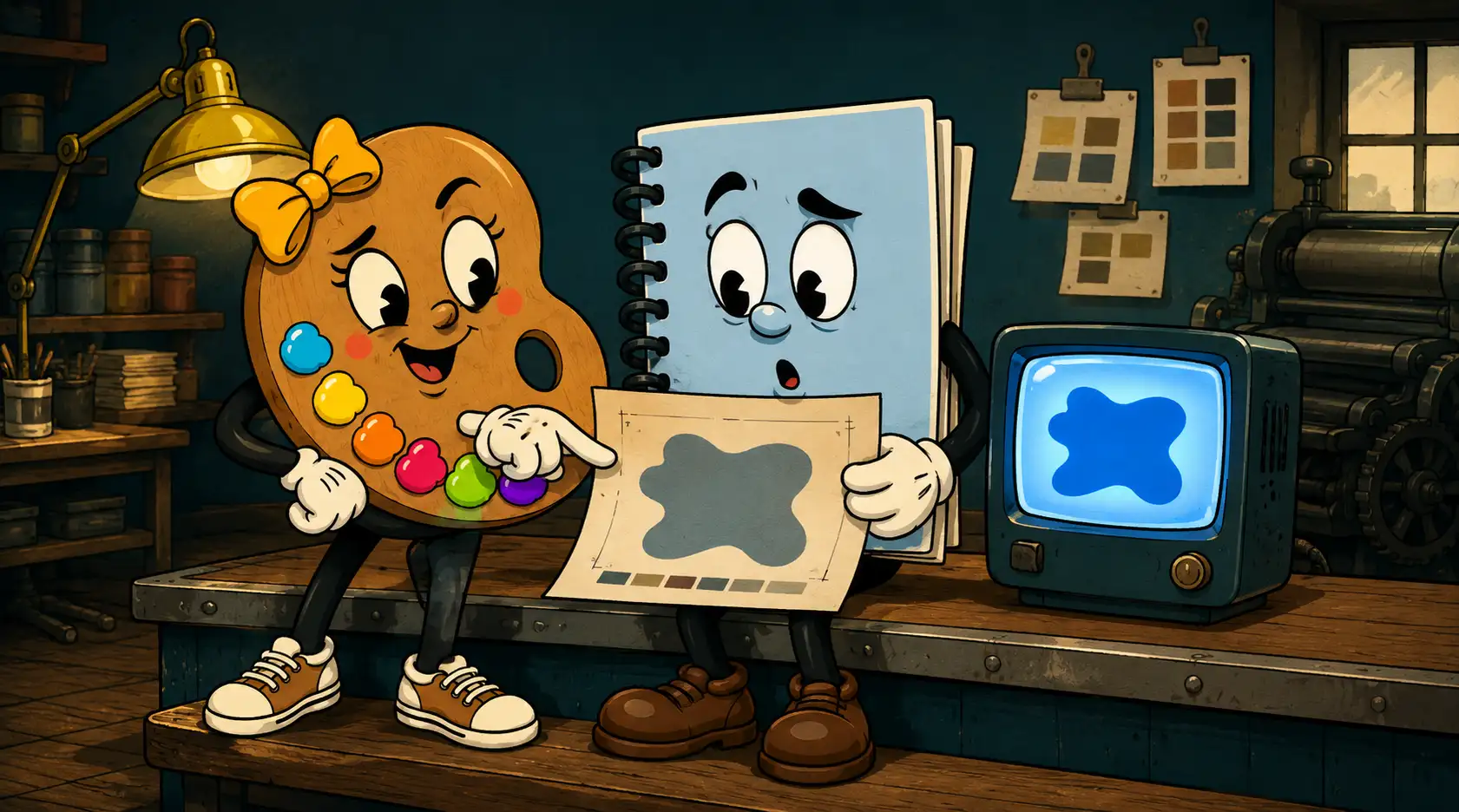
Most people have it flipped. They think the logo is the rebrand and everything else is paperwork, so they want to start where the fun is, with shapes and colors, and they get itchy when I tell them we are not drawing anything for a couple weeks. I get it. The drawing is the part you can show your spouse. But a logo that does not sit on top of a decision is just decoration, and decoration wears off.
Why does a rebrand take so long when nothing looks finished?
Because the longest part of a rebrand is the part you cannot see, and it has to come first.
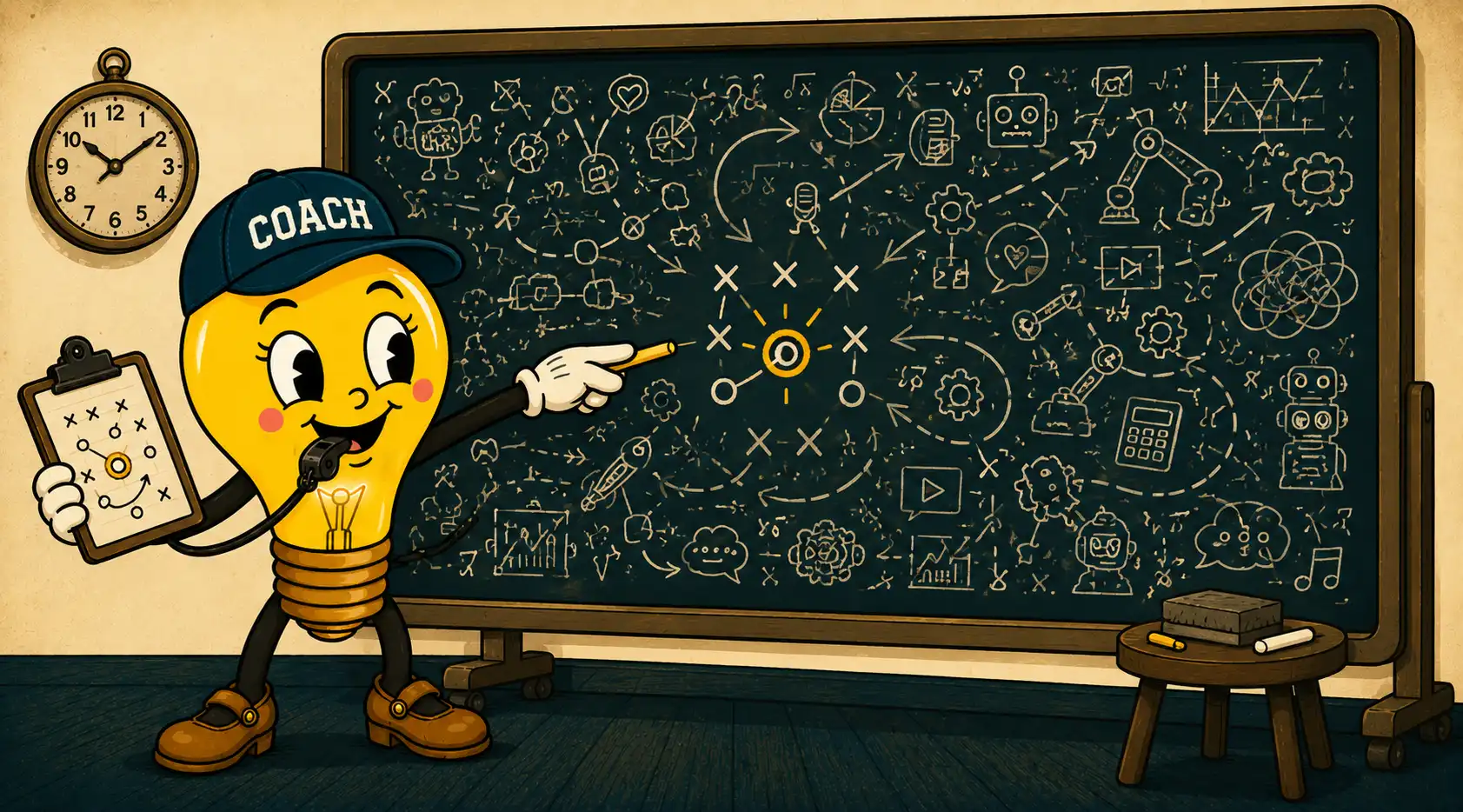
Here is what that quiet stretch is actually full of. We figure out who the business is really for, which is usually narrower than the owner thinks. We figure out what it sells, which is often different from what it thinks it sells (people do not buy the hardware, they buy the guy behind the counter who knows which screw). We land on the one idea everything hangs on, the word or the sentence the whole thing points back to. Then we figure out how it talks, because a sign and an email and a voicemail should all sound like the same business.
None of that produces a file you can look at. That is why it feels like nothing is happening. It is the most important two weeks of the project and it has no deliverable you can frame. Skip it and you have not saved any time. You have just paid a designer to guess.
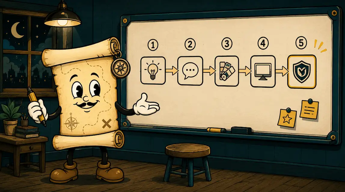
The real order
Strategy. Voice. Visual direction. Then logo and identity. Then the long tail of touchpoints. Doing them in that order is the boring difference between a rebrand that lands and one that looks great but does not change anything.
Spelled out, it goes like this:
- Strategy first. Who it is for, what it really sells, what makes it different from the shop down the road. The one idea everything else hangs on.
- Voice second. How the business talks. Plain or formal, dry or warm, the actual words it uses and the ones it never would.
- Visual direction third. The mood and the lane, before a single logo concept exists. Warm and old and trustworthy, or clean and new and fast? You pick the room before you pick the furniture.
- Logo and identity fourth. Now you draw, and it goes fast, because every choice already has a reason sitting behind it.
- The long tail last. Signs, cards, the truck, the website, the social templates, the shirts. This part can roll out over months. It does not all have to happen the day the logo is done.
Notice the logo is fourth, not first. By the time we get there, half the decisions are already made for us. That is why the design phase is quick when the front end is done right, and why it drags forever when it is not.
Can I just buy a logo and skip the strategy part?
You can, and people do it every day. It costs more than the fifty dollars, just later and in a different currency.
You have seen the version I mean. A logo picked off a marketplace from a grid of two hundred options in an afternoon, or a template that nine other businesses in the county are also using. It looks fine. That is the problem. It looks fine and it means nothing, because no decision sits underneath it. You still do not know what to put on the sign, how to answer the phone, or why a customer should pick you over the place across town. You just have a new picture for the same question marks.
A logo is the souvenir of a decision. If you never made the decision, you just bought a souvenir from a trip you did not take.
Then in two years you do it again, for real this time, and you pay twice. I would rather you pay once.
What it looks like when it works
When the order is right, everything quietly starts pointing the same direction. The sign, the website, the way the owner introduces the business at a chamber mixer, the postcard in the mail. They stop fighting each other. The business starts to feel like it knows what it is, and customers can feel that even when they could not tell you why.
That is the whole game: a business that finally agrees with itself. The prettier logo is a nice side effect. Here in Lima, that front-end work is what the Brain Squad at BeyondVivid chews on before anybody on the design side touches a pencil. It is on purpose, and it is the part that makes the last fifteen percent worth anything.
If you are staring down a rebrand and trying to figure out whether yours needs the full treatment or just a tune-up, that is the kind of thing worth talking through before you spend a dollar on design. No pressure either way.
A few quick questions
How long does a rebrand take?
For a small business, usually a couple of months, give or take, depending on how many touchpoints you have. The strategy and design part can move quickly. It is the long tail, signs and vehicles and a website, that stretches the calendar, and most of that can roll out in stages.
How much does a rebrand cost?
There is no flat price, because no two are the same. A solo operator who needs a logo, a voice, and a card is a different job than a shop redoing a building sign and a fleet of trucks. We quote every rebrand individually after we know what is actually involved. Anybody who hands you a number before that conversation is guessing.
Do I have to change everything at once?
No. The decision and the core identity come together at once, on purpose, so they match. The rest can phase in as budget and timing allow. Plenty of businesses roll the new look out over a year.
Who can help me with a rebrand in Lima or Northwest Ohio?
That is what we do at BeyondVivid. The Brain Squad runs the strategy and voice, and the design and print sides handle the logo, signs, and the long tail from there. If you are anywhere around Allen County and chewing on this, start a conversation and we will tell you honestly whether you need a rebrand or just a few fixes.